DOWN FOR
MORE
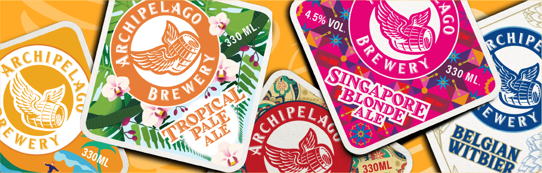
ARCHIPELAGO BREWERY
THE CHALLENGE
The existing brand direction was hyperlocalised, using ‘Singlish’. But with changing market tastes, and an increased appreciation for craft beers, Archipelago Brewery decided it was time for a complete overhaul. How then do we retain the brand’s Singaporean heritage whilst going international?
THE creative
Functioning as the main canvas of the label is a stylised outline of Singapore (diamond shape). The Archipelago Brewery brand mark is a dynamic one, allowing for an overarching ‘standardised’ look and feel whilst providing room for variant customisation. The brand’s humorous personality is evidenced by the easter egg elements. The brand’s beer bottle plays a small, but pivotal role within each variant’s storytelling.


Application


Results
Please get in touch to find out more.